Launching a Nice, Crispy, Treat
identity, packaging, campaign, brand photography

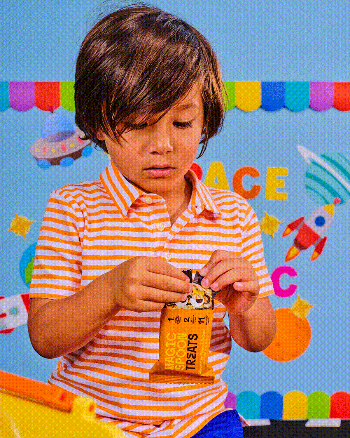
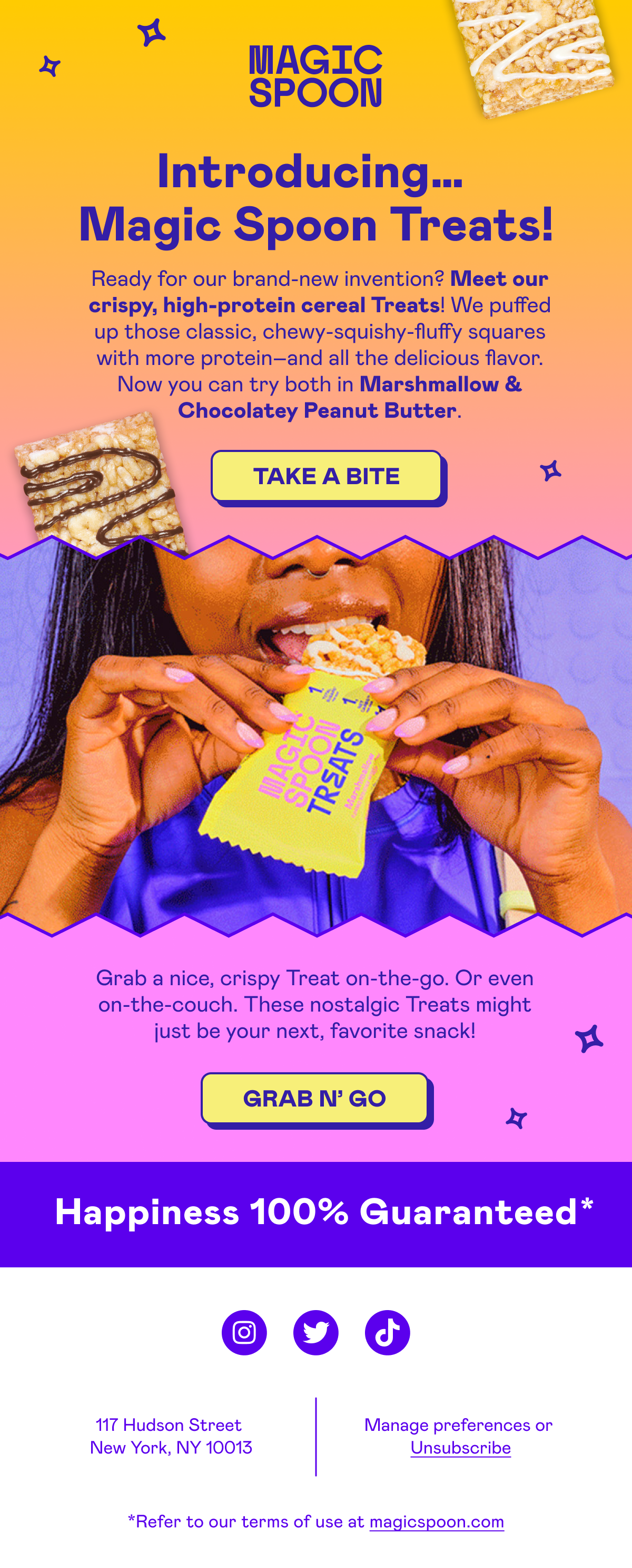
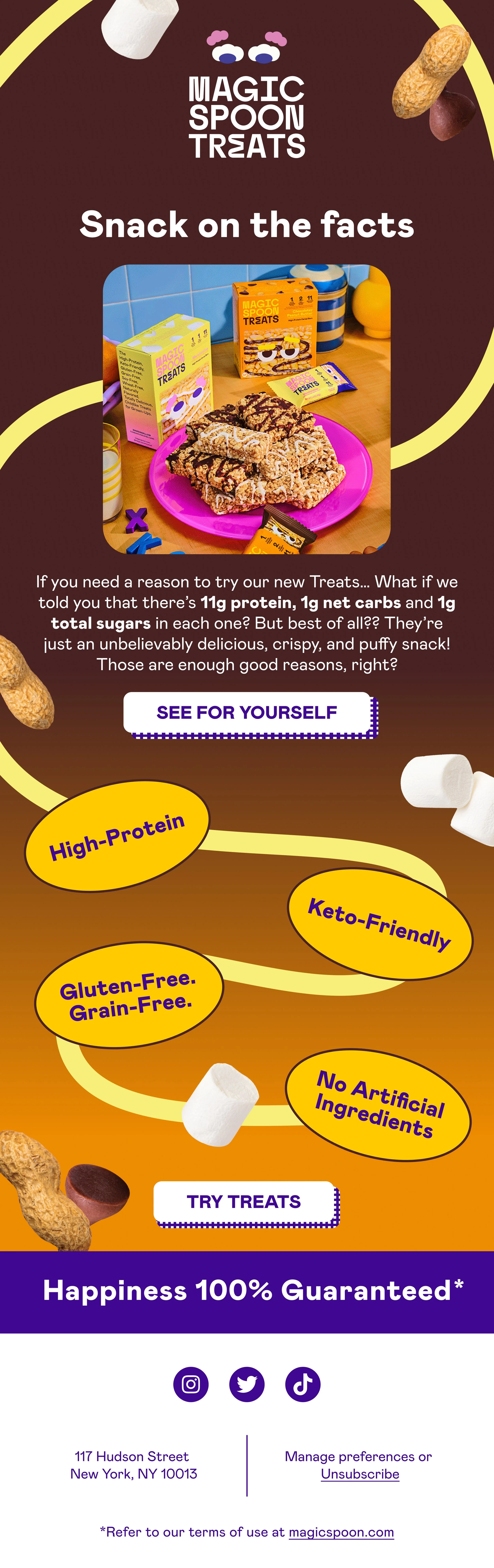
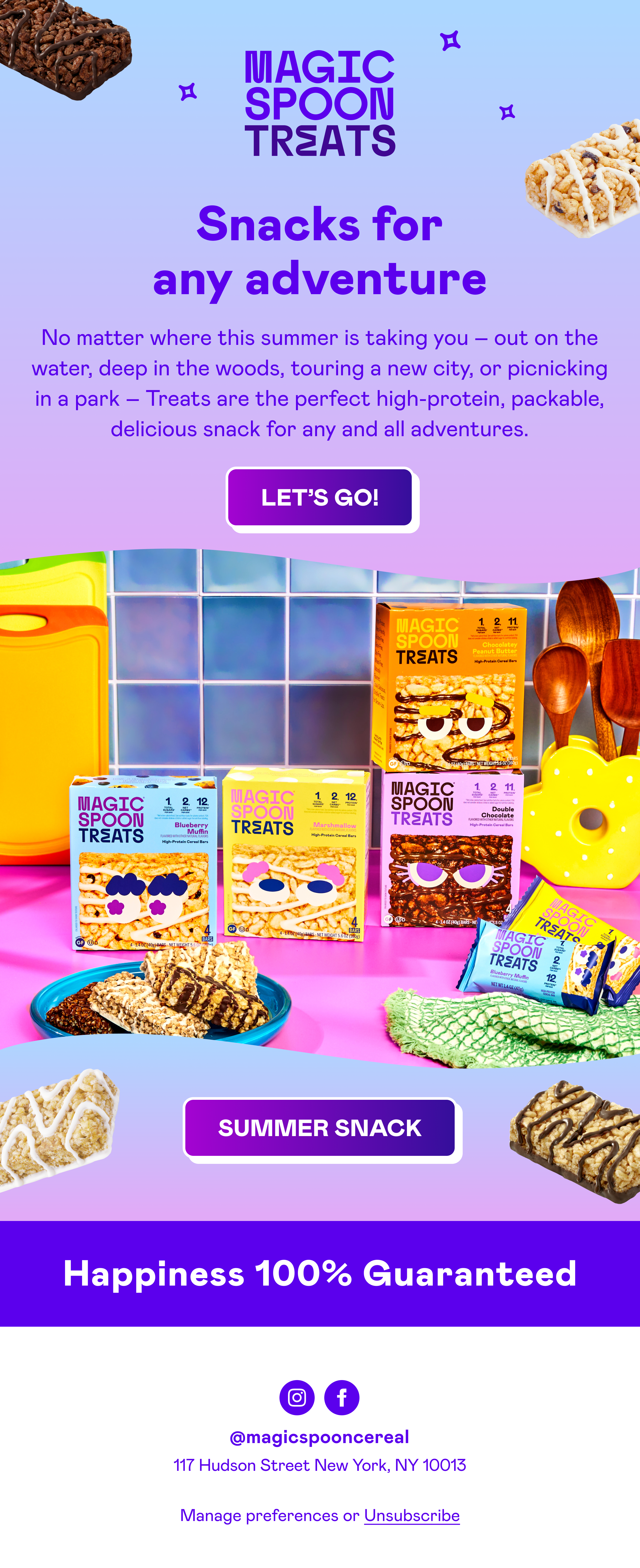
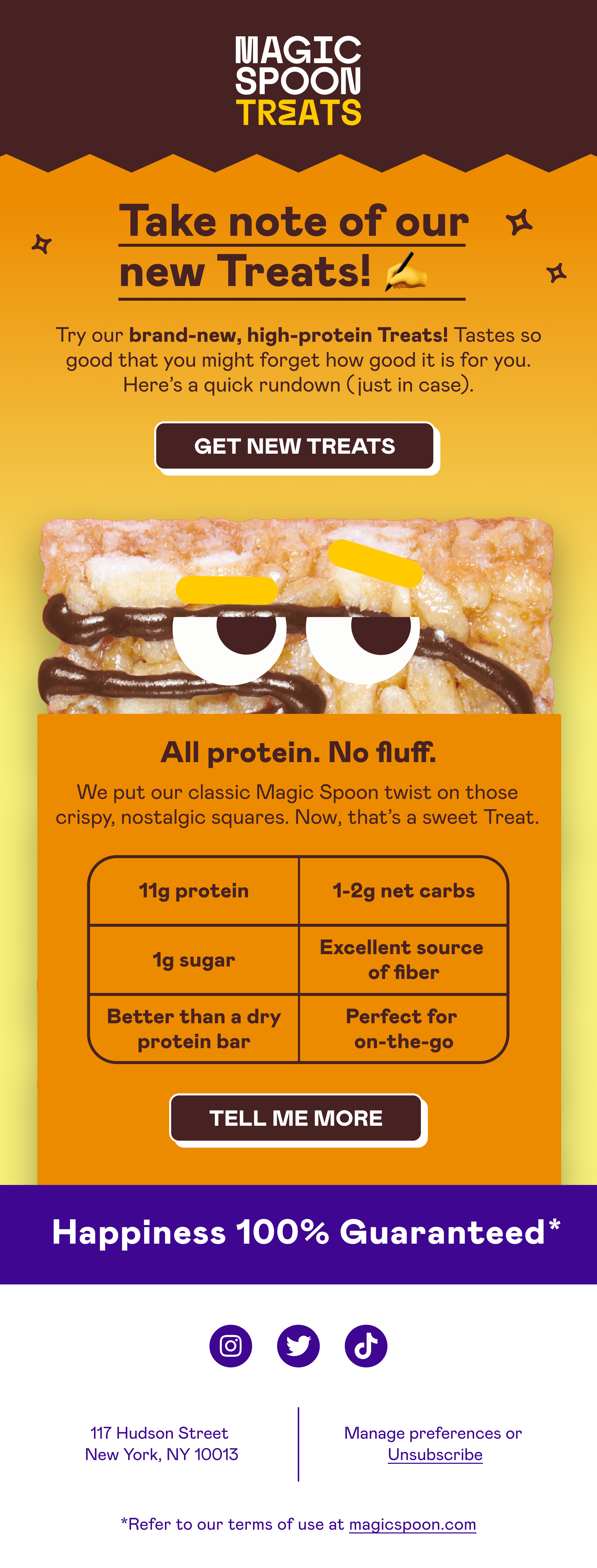
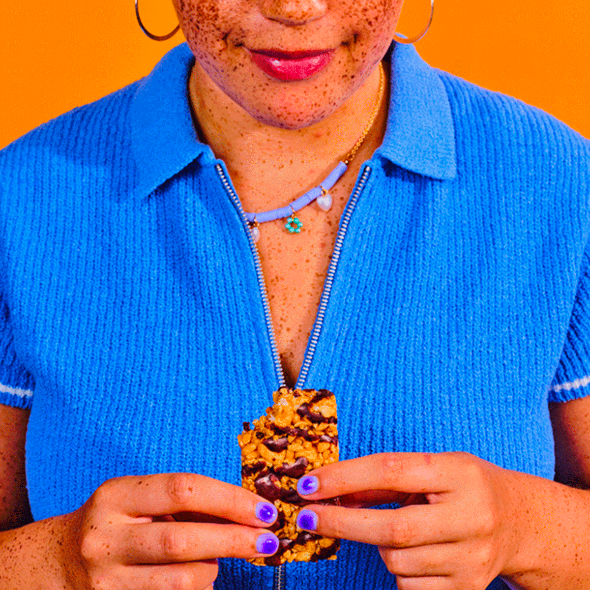
Magic Spoon’s cereal launch in retail was a big success, so we set out to introduce another nostalgic classic: the Rice Krispy Treat. My challenge was to retain the child-like whimsy, vibrant colors, and characters that defined the Magic Spoon brand, while clearly communicating through packaging and campaign messaging what this new product was and why it offered a better-for-you twist. We also optimized the packaging for a soon-to-follow retail launch, ensuring that it would stand out on shelves. A dual-orientation for the front of pack allowed us to adapt to different configs on shelves.
With crisp photography and Juan Molinet’s quirky illustrated eyes—fluffy brows for Marshmallow, berry-shaped pupils for Blueberry, and a salty smirk for Peanut Butter—we gave each Treat its own personality on the packaging. Using just three vibrant colors per flavor, we made sure each one popped on the shelf while still feeling in tune with the Magic Spoon brand.